2020
2024 Update
RGD Honourable Mention for Creative Innovation
Research
UX/UI
Product design
Benya S.
Jessica Dou
Jasper Tu
Figma
Illustrator Autodesk
Air pollution is a global issue.
It is a mixture of various particles and gases caused by vehicle emissions, fumes from chemical productions, power-plants, wildfires, volcanic eruptions, and natural gases (like methane) that can effect our quality of life.
Respiratory vulnerability
As industrialization and urbanization continue to grow at accelerated rates, air pollution has become a more pressing concern. There is a particular concern for vulnerable groups such as the elderly, children, and people with pre-existing respiratory conditions.
Research

Ideation

Refinement
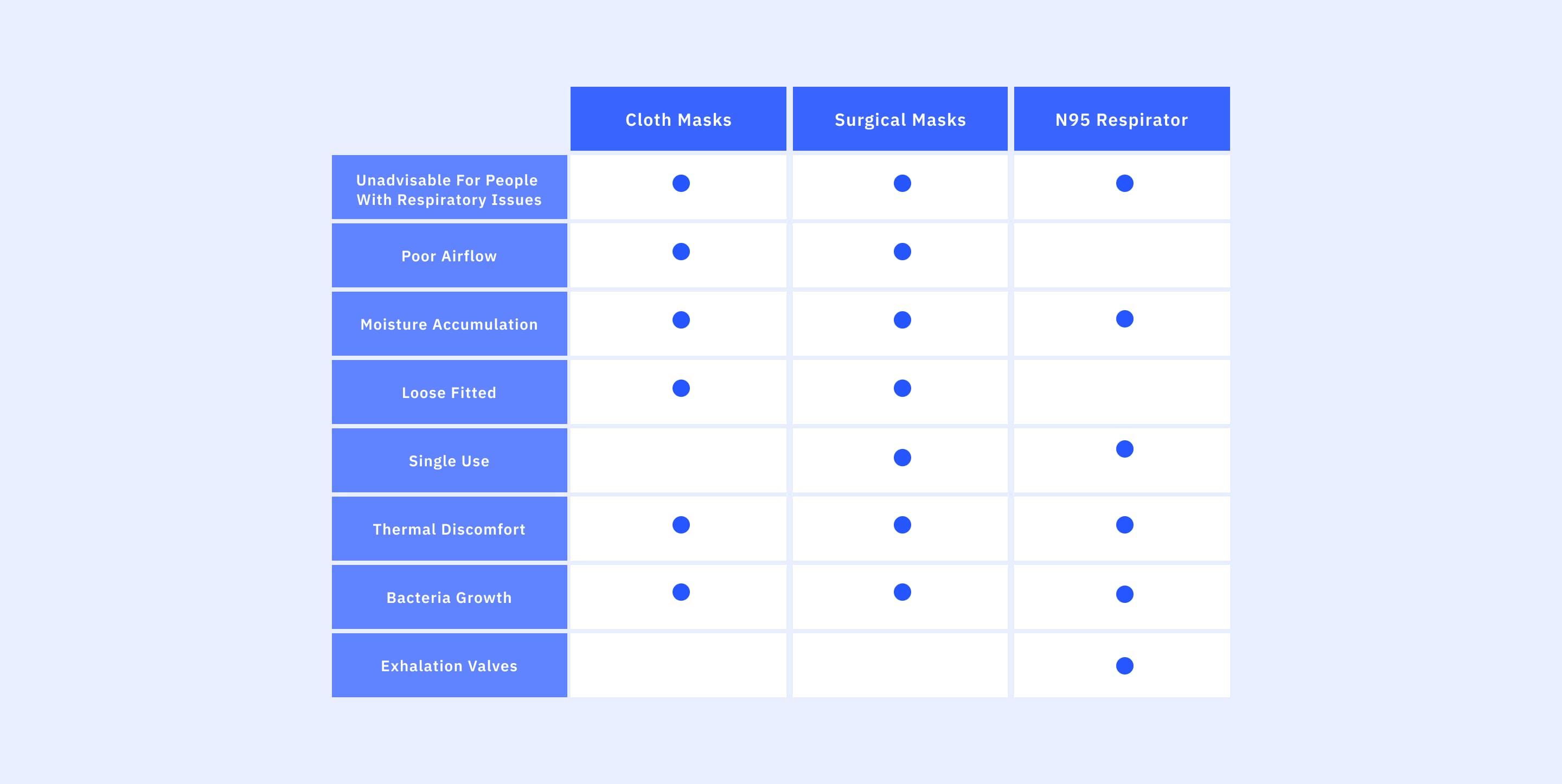
In order to understand our users needs the first step was conducting competitive research on pre-existing masks and their limitations.
The analysis revealed that the most commonly used masks were not recommended for individuals with respiratory issues or children, as they had poor airflow, moisture accumulation, and low filtration efficiency. They are also not designed for different face shapes, and either fit loosely or have restrictions on use. Some masks, such as surgical and N95 respirators, are single-use and not environmentally friendly.
Market Research
Gaps in the preexisting market revealed that common complaints were difficulty breathing, skin irritation from heat and moisture buildup, and headaches caused by pressure from straps or increased carbon dioxide levels. Prolonged wear is not recommended as reactions can become more adverse.
Research

Ideation

Refinement
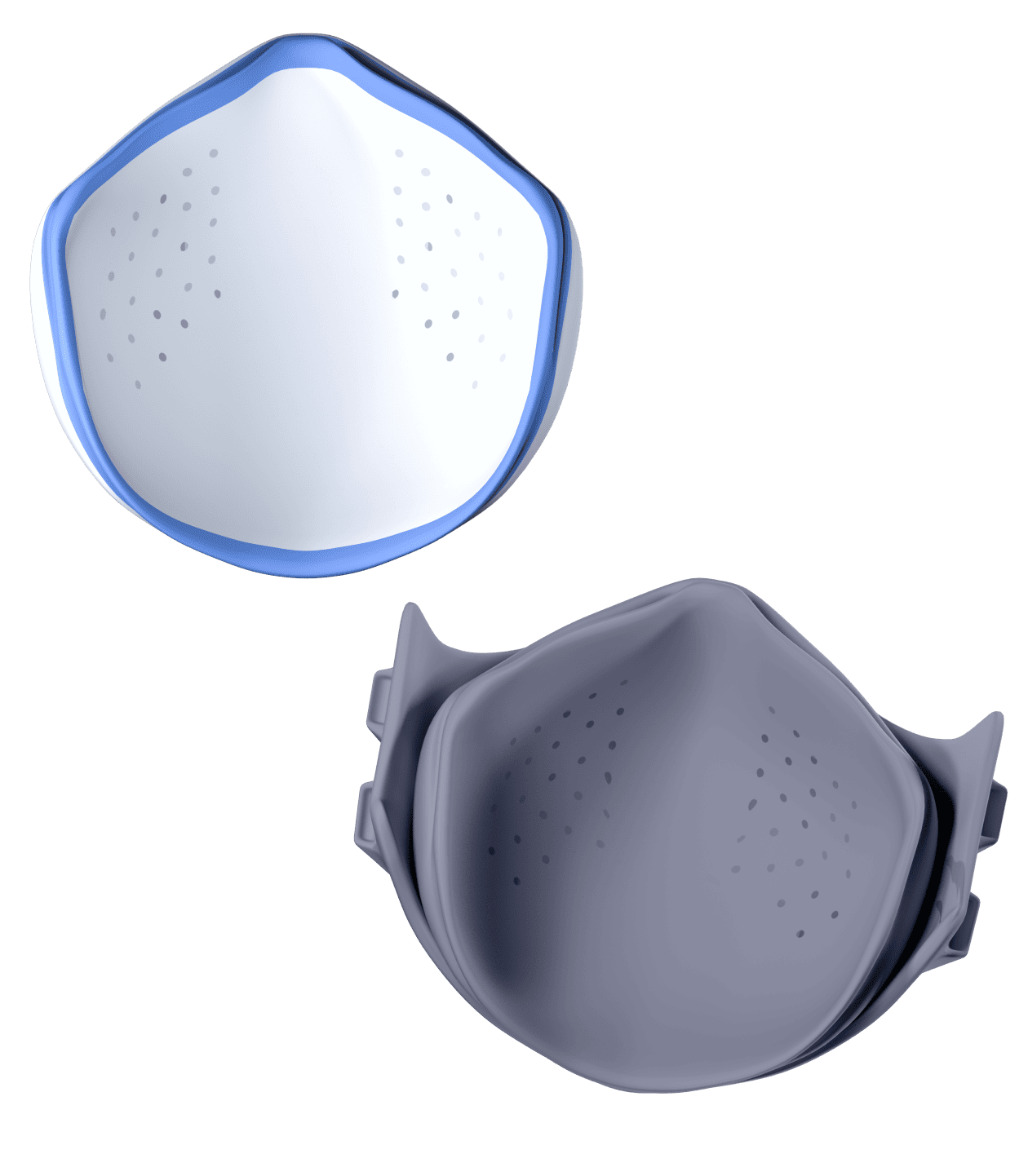
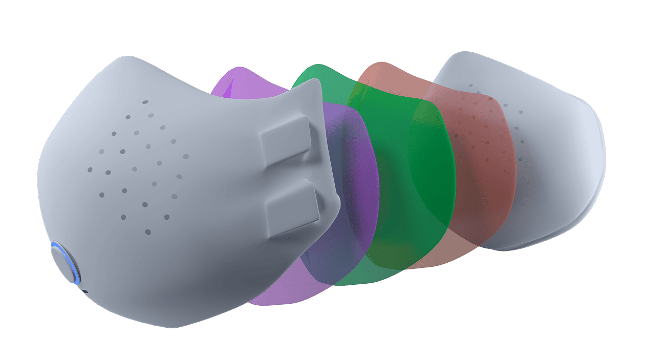
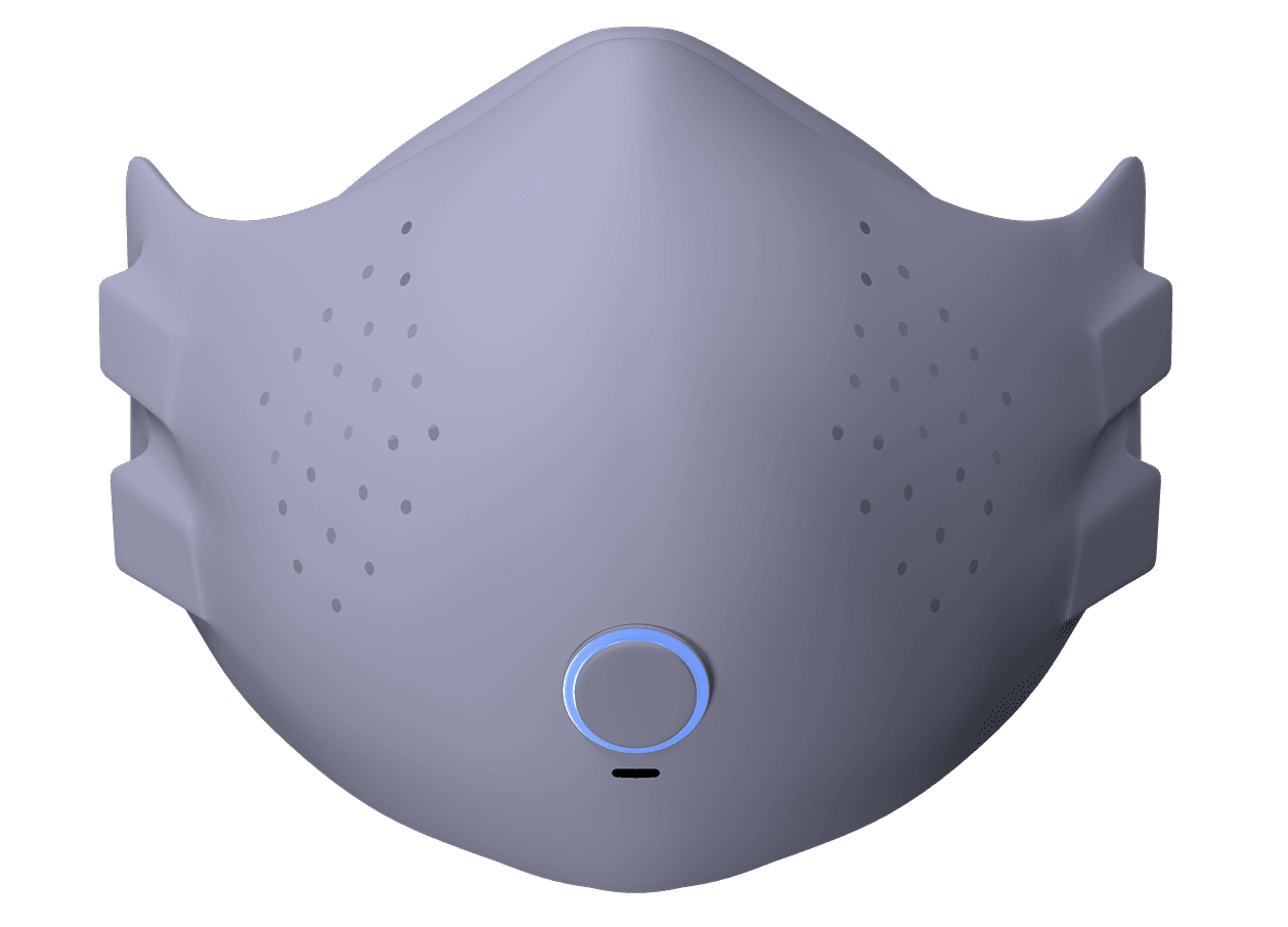
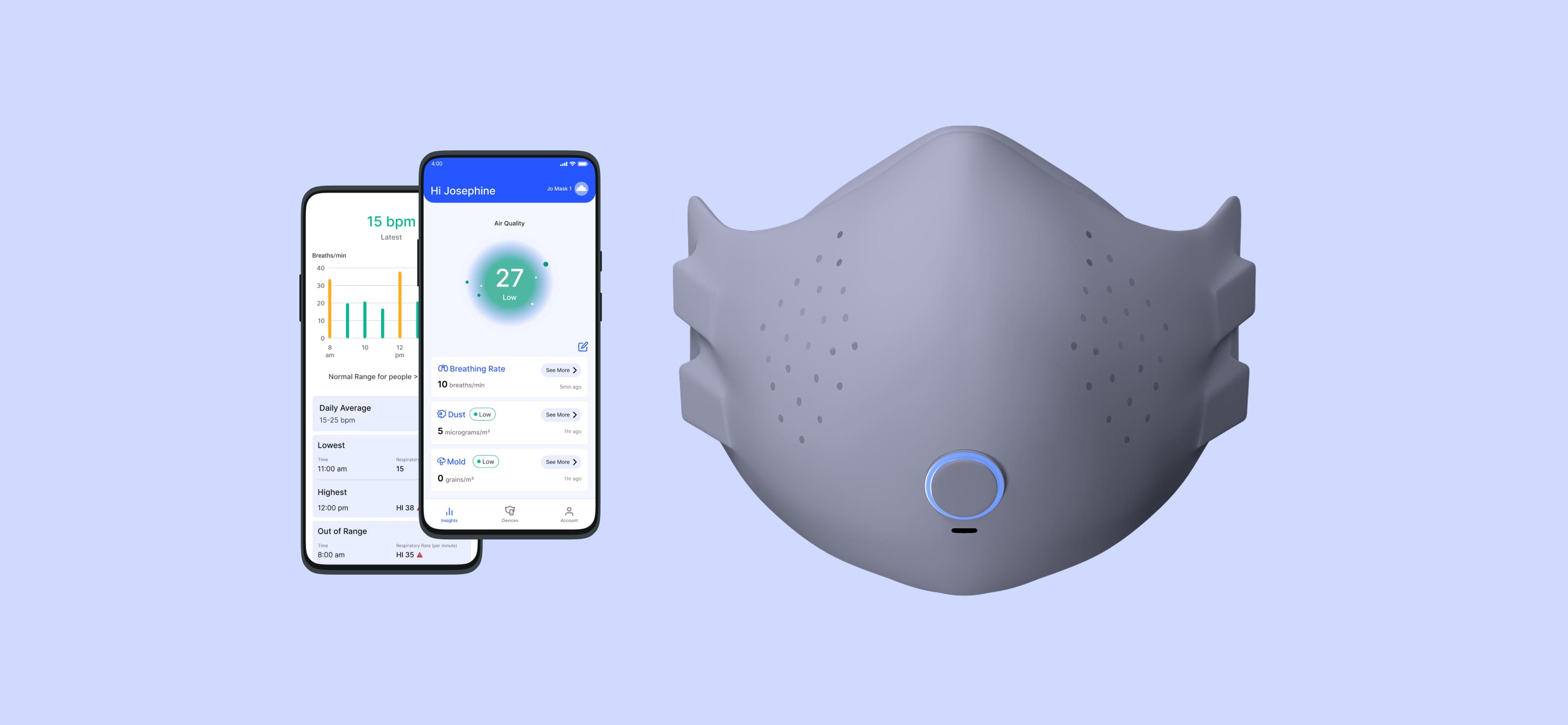
Based on our research, we narrowed down our mask’s core features to being lightweight, adjustable in straps and size, air-sealed with a comfortable fit, and constantly circulating air to reduce moisture. The duo app would provide support by allowing users to monitor their breathing health and the environment.
Rough Work & Development
We began mocking up the design of our mask and its filters. We considered different styles of straps and latching mechanism in order to prioritize comfort.


App Wireframes
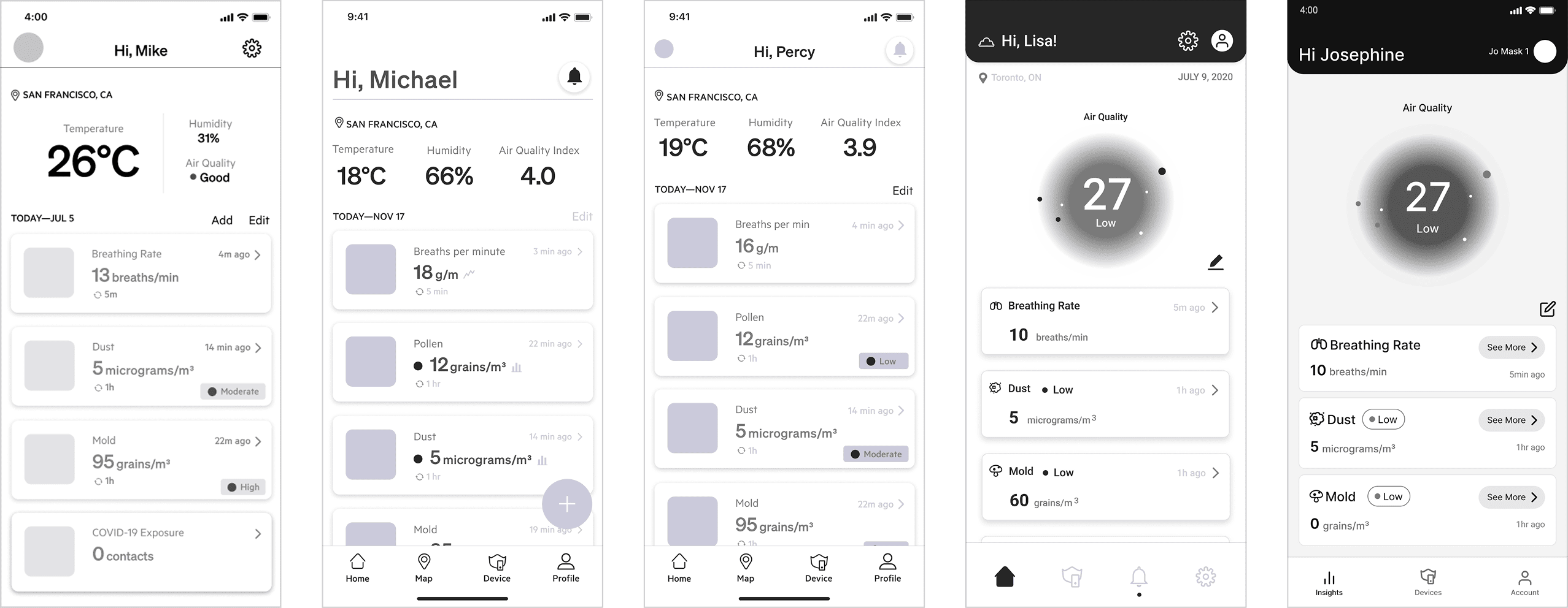
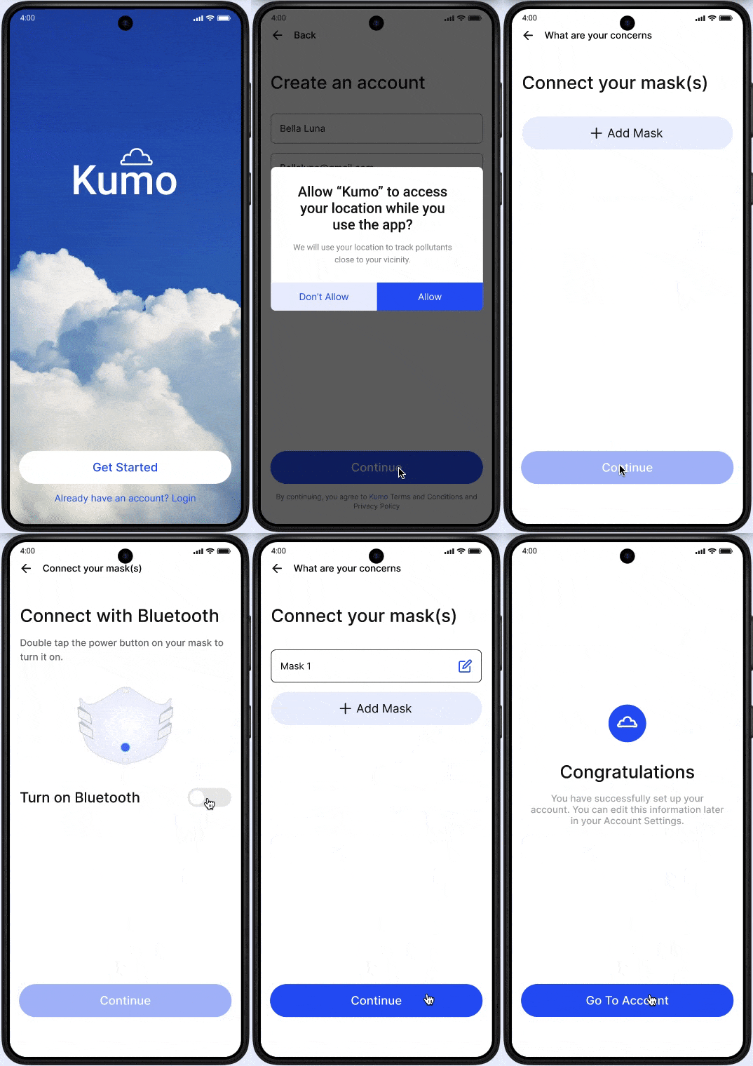
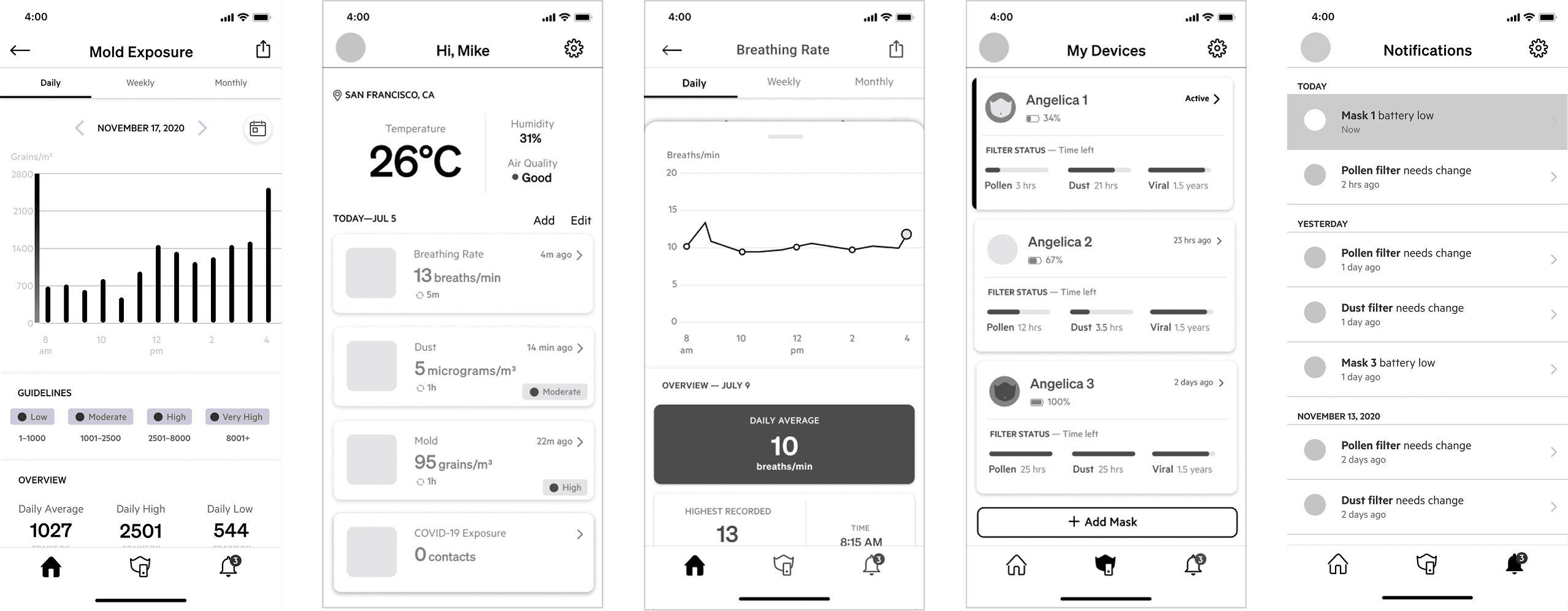
For the supporting application, we focused on monitoring the user’s breathing rate, as well as the surrounding air quality and pollutants in their area. We wanted the app to provide notifications for daily health alerts, such as high concentrations of pollen during allergy season or dangerous levels of carbon monoxide during forest fires. The app will also feature flashcards and learning improvements tailored for different concerns, such as breathing techniques for individuals with low respiratory rates.
Research

Ideation

Refinement
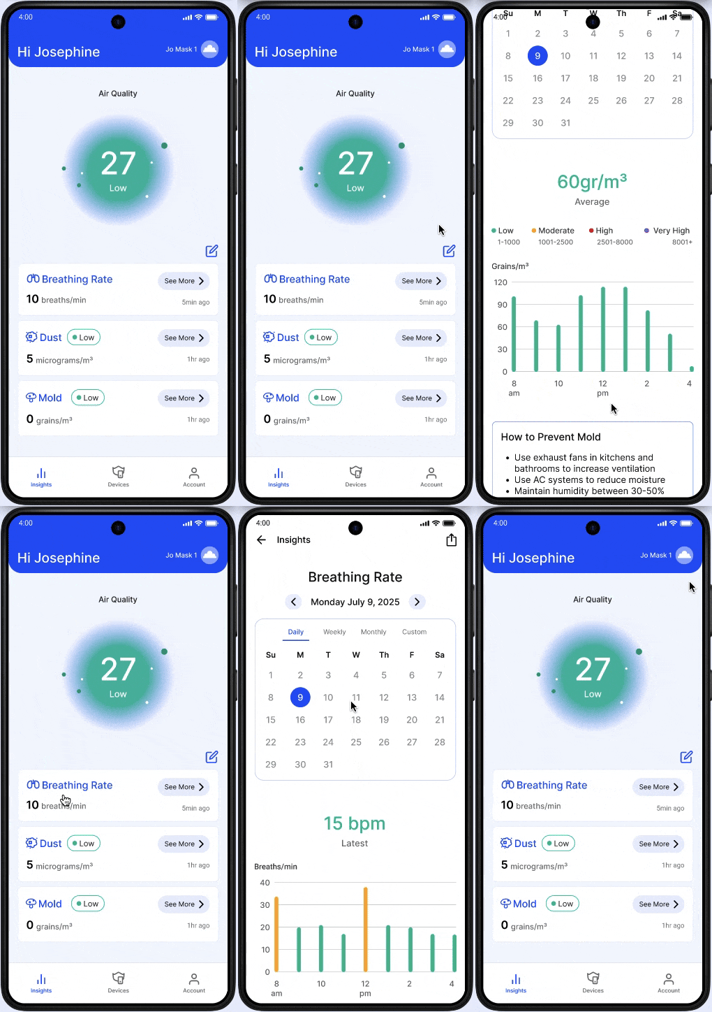
While the Kumo application is very data-driven, we didn’t want it to be overwhelming for the user, which led to many refinements. The images below, from left to right, show the development of the Home page and how the visual hierarchy of the final design becomes more scannable for the user and how it highlights important information.
